Wednesday, February 26, 2014

Gothic Period

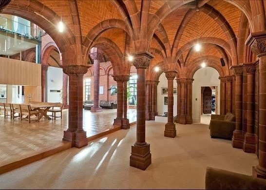
The Gothic period was birthed from the Romanesque period and is the bridge between Romanesque and Renaissance. There are three distinctive styles in the Gothic period which include pointed archs, ribbed vaults, and the flying buttress. This style appeared very weightless with the pointed archs and the chapels had large stained glass windows.


The pointed arch suggests height. This appearence is enhanced more by the architectural features and the decoration of the building. This verticallitay and height suggests an aspiration to heaven. On the exterior the verticality is emphasized by the towers and spires.


Salsbury Cathedral has the tallest spire in England

Current Applications:


Extra Resources:


I really liked this video that someone took when they visited Norte Dame in Paris because from just looking at the pictures you can't really see how big the buildings are and in this video you get more of the sense of vericality and the detail that is in the architecture and decoration. 


Monday, February 17, 2014

Romanesque

Romanesque architecture combined features of ancient Rome and Byzantine styles. Its known for its semi-circular arches and vaults. There were a lot of churches built in this period and the most important are the abbey churches. Church walls were painted in blues, greens, purples, and golds. An arcade is a row of arches supported by piers or columns that are found in large churches. They are used as a structural element but also sometimes used as decoration.

The vault at the Abbey Church of Saint-Foy

Example of arcading.

The Corinthian style is the inspiration for many Romanesque capitals. The Pisa Cathedral, for example, was a lot closer to the classical styles.


Examples of the Corinthian styles that were adapted in the architecture during the Romanesque period

Current applications of modern Romanesque architecture:


Response to Natalies and blogs:

When looking at Natalie's blog I really loved the current application she showed with the vaulted ceilings and the columns with the blue walls. I think its a really cool example of a modern application because you can see on the columns they have the corinthian style capitals which i thought was very interesting. I also really enjoyed Lindsay's current applications as well. I didnt realize how common the semicircular archs were with windows in todays designs and I thought that was very cool that she showed that.

Monday, February 10, 2014

Pompeii

Pompeii was a Roman city of about 20,000 people. Pompeii and many villas were destroyed and burried under 4 to 6 meters of ash caused by the eruption of Mount Vesuvius. Pompoeii is now a destination for tourists and has been for 250 years. The first time any parts of the town were discovered was in 1599 and architect Domenico Fontana found many frescoes. Decorations of important sites would be the first style that was used which mimicked marble stone. Their favored building material was tufa stone. When looking at the interiors you can find that there are deep frescoe colors and mosaics. Some used deep reds and yellows to draw attention to small art pieces.


Current Applications:


Response to Megan S and Yo's Blogs:

I really liked reading Megans blog and I thought it was really interesting how she showed the objects that were recovered. Its interesting to think about the fact that these objects didnt deteriorate because of the lack of air and moisture. I also really loved Yo's visuals that he included in his blog. It was pleasent to read because he had a lot of different pictures of the styles of interiors and also I really liked the second current application picture because it was a really good example of how that style is used today.

Sunday, February 9, 2014

Byzantine

The Byzantine Empire lasted from 324-1453 and its current name is Istanbul. This time period was influenced by the Greeks and Orient. The Basilica plan changed to a more centrallized plan and they combined east and west styles where they would have a dome and a square base. They had a Pendentive method to support the circular dome on the square base.
Byzantine interiors had marble flooring with geometric designs and marble and mosaic surfaces on the walls. Byzantine furniture had some classical forms for chairs and chests. They were made out of wood or metal. Some are X-shaped and some are carved with animals and are very detailed. 

Modern Byzantine furniture might look something like these:


Response to Kristina P and Justines Blog:

I thought it was really cool how Kristina talked about current Byzantine interiors. My favorite picture of hers was Romeo Gili's apartment and how he applied tile on the walls and how he included geometrics in his design- that really showed how Byzantine style can be incorporated into todays designs. I also really enjoyed reading Justines blog because I loved seeing the magazine photo with the Byzantine style jewelry. I think thats a really cool way of looking at current applications and how weve adapted those styles.


Wednesday, February 5, 2014

Early Christian

This period dated from 330- 800 C.E. and I found this period to be very interesting with how it was solely the lower class and then grew and grew. Although there were many prosecutions, Christianity prospered and eventually became the largest religion of all time. When Christianity became a valid religion because of the emporer Constantine, christians were now allowed houses of worship and the ability to display holy artifacts. The archtieture adapted the Roman basilica form for their churches as well as having centrally planned buildings. 

Below are exmples of a basilica style church and also a centrally planned place for worship


When it comes to early Christian furniture, there are few examples. However they were very elaborate and decorated with carvings and jewels. Storage was very important in this time period
Examples of early christian furniture:


Examples of this style in the modern world:


The last two pictures were designed by Clive Christians and I think the last picture is really neat because it kind of has that centrallized feel to it like how some of the worsip buildings were centrally planned. 


I really enjoyed reading Sammy's blog. I thought it was really cool how she compared early Christian's celestory windows to how they might be incorporated into todays designs. I also thought the photos on John E's blog were very captivating. It was really interesting how he showed the symbol of the fish on the car because it's just amazing to me that those symbols from so long ago are still around and have carried on to this day. It's really fascinating and cool to think about.